
(no title)
jfarmer | 2 years ago
Kinda frustrating that the main link dumps me onto what reads like a university syllabus, and nothing original, visual, or intuitive.
If I click through the sections in order, there are 5 "preamble" sections describing logistical and other meta-information about the course. All text.
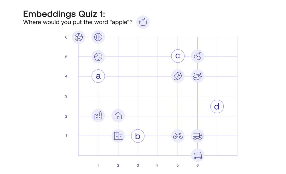
The first pedagogical image I see this this, which tbh doesn't make any sense to me: https://files.readme.io/329efd5-image.png
"Where would you put the word apple?"
The image alone doesn't work without reading the supporting text very closely. I also have to have a pretty sophisticated understanding to get the idea that I can represent words as points in a plane.
Representing the words as icons is fundamentally confusing, too, I think. After all, maybe I say the word "apple" should go in "d" because it has at least two senses: a fruit and a machine.
Oh, sorry, you failed your first quiz!
"You can't fail the quiz, you're not being graded." Then why call it a quiz? Why use classroom metaphors unless you want students to fall back on classroom behaviors?
Of course, you know the #1 student classroom behavior: not reading the syllabus.
But if I have no trouble with that level of abstraction, what's with the cutesty way of describing the problem?
Get rid of all this chocolate-covered broccoli. Just say and show what you mean.
Computers like numbers. Vectors are lists of numbers. Vectors come with concepts like length and distance. We want to transform words into vectors so that words we think of as similar are close together as vectors.
There are many ways to translate words into vectors. Here are 5-10 examples of how we might do that. What are some pros/cons? What relationship(s) do they make clear or obscure?
Get them thinking about what it means to embed things and why we'd want to embed words one way vs. another. That'll pay dividends. Having them remember "where the apple icon goes" isn't going to be something they'll benefit from reflecting on in any future experience.
pumanoir|2 years ago
Your suggestion may work for other intents (like having a Schaum's Outline of LLM's) and I would also love to have that additional material (maybe yourself could provide it as it seems you have a clear idea)
jfarmer|2 years ago
If the premise of the material is that phrases like "dot product" can be used freely or with minimal explanation then images like the "place the apple quiz" make even less sense. For that person, not much more needs to be said than "We want to represent words as vectors so we can do linear algebra with them. If the representations preserve structure we care about then here are some cool things that happen: (examples of good and bad embeddings)."
Then go deep, having given them an adequate advanced organizer.
jayalammar|2 years ago
enumjorge|2 years ago
Like the grandparent comment mentioned, the pitch is "visual, intuitive explanations", but I don't see that on the landing page. I'm looking for a way to get to the start of your content, but the top and left hand menus don't help and are, if anything, confusing until I realize that I'm now inside of a larger set of documentation unrelated to the course.
Below the fold we see a "Let's get started!", but the link I see, Structure of the Course" doesn't sound like getting started. It sounds like more front matter. From the nav menu I see that after that I still won't get to the content, but instead a page about the instructors. Do I really need to read blurbs of the instructors before I get to the meat of the course?
It just feels like too much wrapping paper and packaging to get to the good stuff--and it really does seem like good stuff! And I think the way that you've embedded this course into the rest of your documentation prevents you from presenting it in a structure that is more familiar and easy to navigate (e.g. an 'About' link at the top that talks about the instructors and Cohere).
It might be frustrating to put a lot of time and effort into high quality materials, only for people to not want to spend a few minutes looking around, but from the audience perspective, there's a sea of LLM-related content out there. I want to quickly determine if this is worth adding to my already-too-long list of LLM related bookmarks of things I want to read.
jfarmer|2 years ago
Is your goal to make it feel like a typical university course or like something else?
If like a typical university course, start with a syllabus and a course description and all the logistics.
If like something else then the first 10 seconds of the experience should make people go "Oh, this is different."
What's happening in the first 1 second, 30 seconds, 1 minute, 10 minutes, etc. that are reflective of the rest of my experience? That will serve as an advanced organizer for what's to follow?
The very first graphic I see is labeled as a "quiz" and requires me to read a bunch of surrounding text to make sense of it.
That's the vibe: a promise of something visual and intuitive, first consummated by a long syllabus and a quiz.
digging|2 years ago
samstave|2 years ago
SanderNL|2 years ago
TeMPOraL|2 years ago
EDIT: in some sense, the whole idea and usefulness of embedding comes from it working like the inverse of this kind of "intelligence"/"logic" tests - tests that ask you to which, out of several groups, a new symbol belongs. Usually there are couple competing answers, but the test has you guess the one that's the Right One. Embedding is about subverting this - it's about telling the test giver, "you know what, it actually belongs to all of them", and adding enough dimensions to the problem space that you can have all the groups be far away, from each other, and the new thing close to all of them - to each along a different dimension.