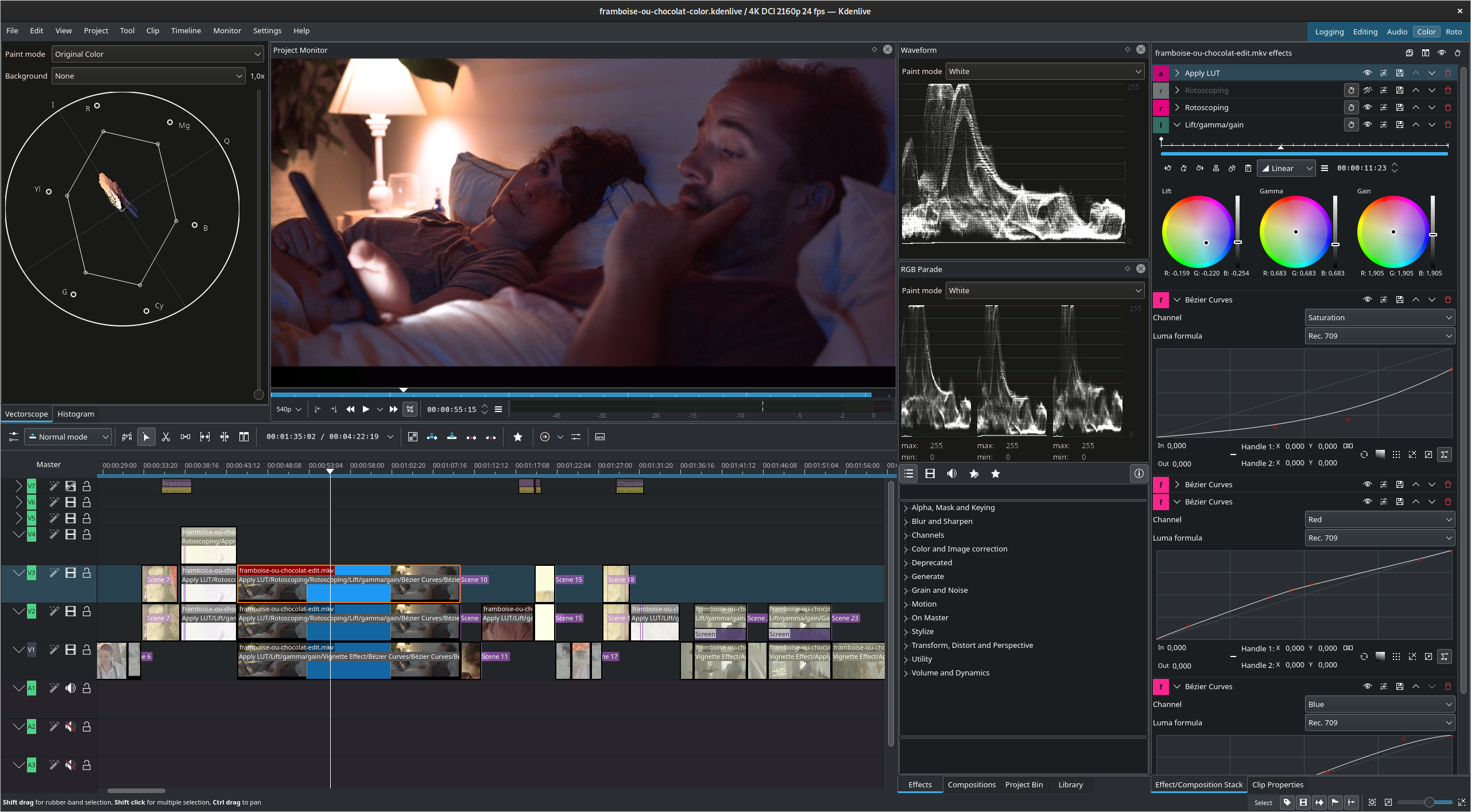
GNOME applications look so... mobile. Large controls, large title bars that lack maximize/minimize, simplistic layouts. It might be good for this kind of frontend apps but I can't see software like Krita or KDEnlive being done for GTK4/GNOME as of today (for reference: https://kdenlive.org/wp-content/uploads/2022/01/271174170_10...)

Narushia|2 years ago
I think the UI elements could be a tad smaller on desktops, but I’m still happy with how they look. Easily the best UI design out of any Linux desktop environment right now. At least in terms of clarity and consistency.
[1]: https://blogs.gnome.org/shell-dev/2022/09/09/gnome-shell-on-...
zepolen|2 years ago
Gnome is the most ghetto desktop environment out there.
oliverkiss|2 years ago
GNOME applications are pretty simple and there's no software like Krita and KDEnlive, but I don't think that GNOME HIG is the limitation for that.
smoldesu|2 years ago
Not a very productive editing experience in my opinion though, definitely still prefer KdenLive or Davinci Resolve.
kevin_thibedeau|2 years ago
catboybotnet|2 years ago
dijit|2 years ago
But you're painting an inaccurate picture here, GNOME controls are a larger ratio than they've ever been to screen real estate;
For context, this is how it looked on a 640x480 display https://commons.wikimedia.org/wiki/File:GNOME-escritorio-1.x...
JohnFen|2 years ago
pqb|2 years ago
Ironically, I see the designers of macOS built-in applications (e.g. Finder.app or System Settings.app) are following their GNOME counterparts rather than the other way around. Since Maverick, Apple has lagged behind in terms of UI innovation and it is the GNOME designers, who are pushing forward with new ideas. The addition of a header bar in Finder.app and Nautilus made them much more usable for me [0] [1]. The same can be said for System Settings.app [2], which now follows the design and layout of the GNOME Control Center. GNOME has been a copycat for many years, its UI was inspired by macOS/iOS, but now the roles are reversed.
The missing piece of the puzzle is searchability, which GNOME 3.x+ lacks and which GNOME excelled at in the days of Unity DE. Hopefully GNOME 40+ will bring some improvements in this area.
JohnFen|2 years ago
Heh, those are all on my list of things I hate about Gnome. Funny how different people can be.