That one visual is far better than the original article, which blithers about this change without showing it.
It's not even clear how that package is used. Do you invert it and snap open the brown plastic flap, or what? Was that just concept art, or did they actually sell that.
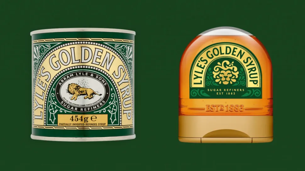
What they seem to be selling now is a minor mod to the 19th century design.[1]
Agree that the picture is worth a 1000 words, but per kingkongjaffa, one is a squeezy bottle while the other is a robust tin.
My dad used to have dozens of the tins in his shed, each holding a collection of screws, washers, resistors, capacitors, bolts etc 'that will come in useful one day'. I still can't see the tins without thinking of his re-use collections. That's my biggest gripe with the new container: it's a single-use throw-away plastic thing. The traditionalist press in the UK is also upset by the new image: stylised logo, compared with a 'proper' picture of a sleepy lion surrounded by bees.
Its a plastic squeezy bottle, the brown cap has a lid section that opens and theres a hole membrane, you squeeze the side and this pushes the contents through the membrane.
If there was ever a good rebranding that stays true to history it's this one. A dead lion swarming with insects isn't the most appetizing thing. A lion with a bee reminds of the story in a tasteful way. They could have kept the biblical quote.

Animats|1 year ago
It's not even clear how that package is used. Do you invert it and snap open the brown plastic flap, or what? Was that just concept art, or did they actually sell that.
What they seem to be selling now is a minor mod to the 19th century design.[1]
[1] https://www.amazon.com/Lyles-Squeezy-Golden-Syrup-325g/dp/B0...
KineticLensman|1 year ago
My dad used to have dozens of the tins in his shed, each holding a collection of screws, washers, resistors, capacitors, bolts etc 'that will come in useful one day'. I still can't see the tins without thinking of his re-use collections. That's my biggest gripe with the new container: it's a single-use throw-away plastic thing. The traditionalist press in the UK is also upset by the new image: stylised logo, compared with a 'proper' picture of a sleepy lion surrounded by bees.
kingkongjaffa|1 year ago
unraveller|1 year ago
What do you expect, she showed it to her followers and they hated her for it. It's also on a site that introduces the owner by name every post.
grey_earthling|1 year ago
The packaging (tin versus squeezy bottle) isn't changing — they already sell both.
Only the labels are changing, and they're keeping the tin (specifically) unchanged: https://www.bbc.co.uk/news/business-68347249
amadeuspagel|1 year ago
unknown|1 year ago
[deleted]